Maison Mimosa
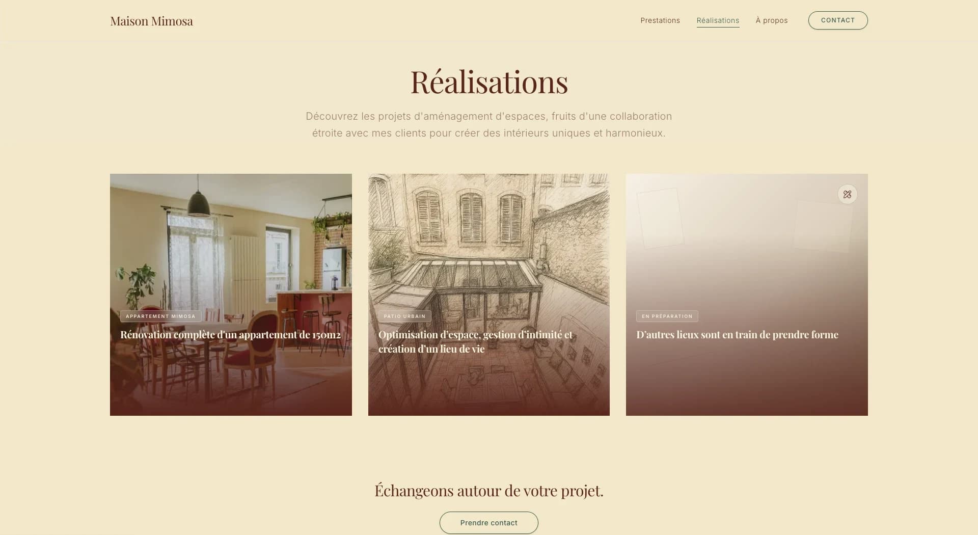
An editorial website for an interior design studio in Marseille, built around imagery, project storytelling and an interactive before / after.
Overview
I developed the frontend for Maison Mimosa, translating its visual identity into an editorial website built around imagery, project storytelling and interactive before / after exploration. The brand, its identity and the interior projects are Maison Mimosa's; the site is where I come in.
Problem
Interior design is sold through pictures. The site had to give the work room to breathe and let people explore a project the way they'd walk through it, without looking like yet another decoration-studio template.
What I built
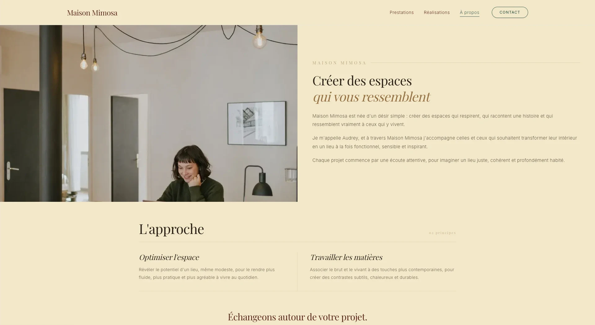
- Pages for the services, a portfolio of projects, detailed project pages, editorial content and an About page.
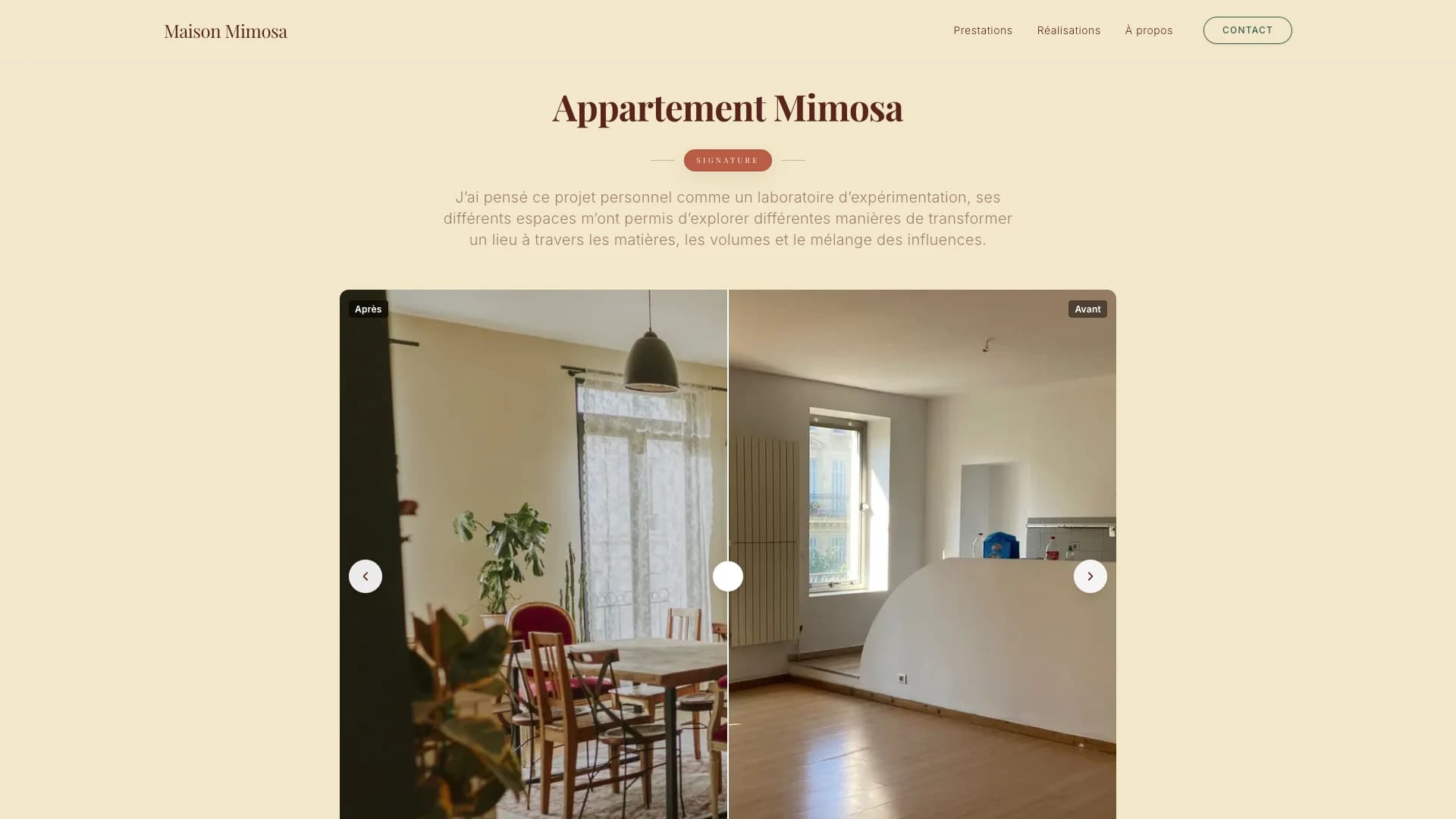
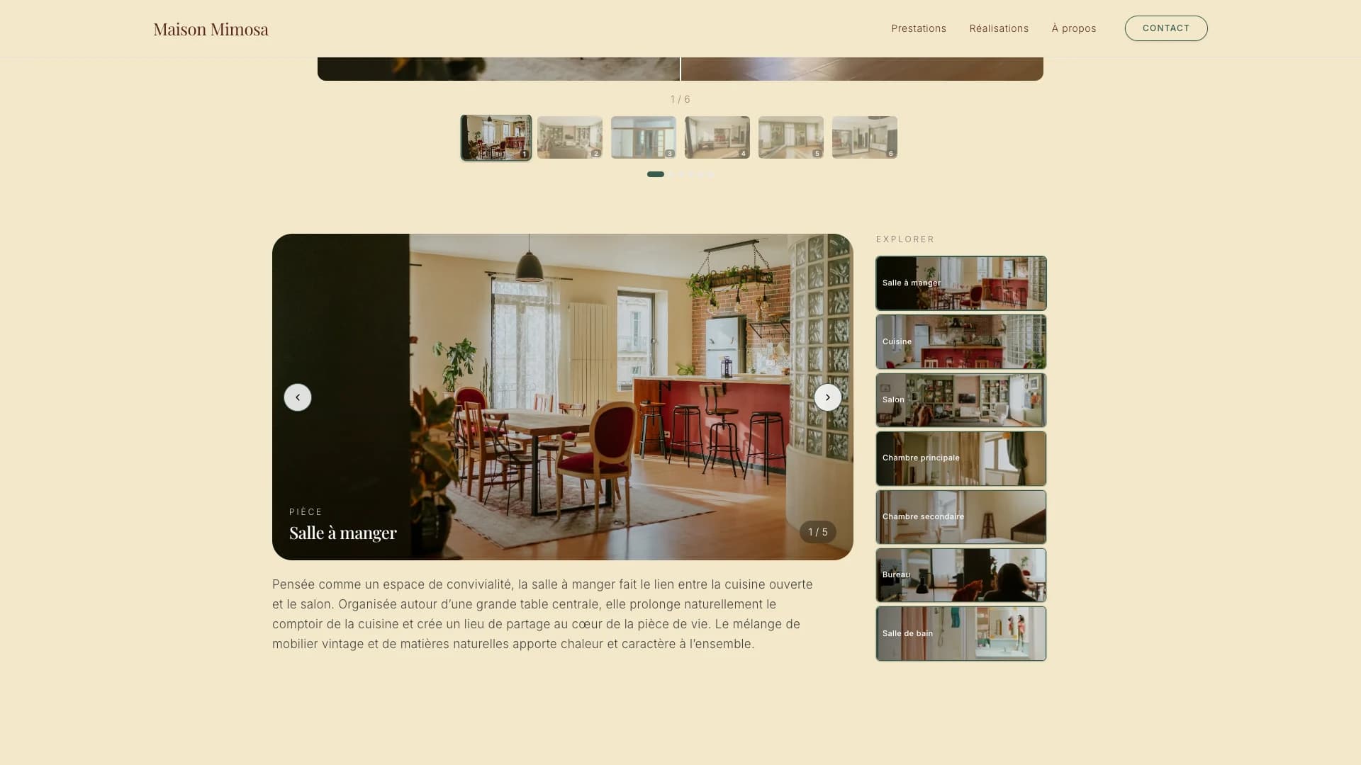
- On project pages like Appartement Mimosa: an interactive before / after comparison, navigation between images and between rooms, and a secondary gallery of thumbnails.
- Editorial text attached to each space, so a project reads as a story rather than a photo dump.
- Responsive layouts where the images stay the main thing on every screen size.
Technical decisions
The project page as the core experience
The Appartement Mimosa page is where most of the frontend work went: before / after, moving between rooms, thumbnails and the text for each space all have to work together without the page turning into a control panel.
Design tokens in CSS custom properties
Colours, type and spacing are defined once as CSS custom properties, next to Tailwind CSS v4. The identity stays consistent across pages, and changing it means changing a handful of variables.
Images first, effects last
Most of the time went into typography, image handling and a few small interactions. The goal was a site that feels crafted, not one that shows off.